


Imagine you are just entering a site, for example, unsplash.com. A site with lots of high-quality images must take too long to load, right?
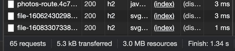
Although it may be a huge download of data (3MB!), it's really small compared to what it could be...
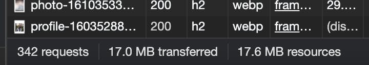
This new screenshot shows how many MB were downloaded after scrolling on their home page. How did they do this?
Introducing Lazy Loading
Ask yourself this question: when you enter a site, let's say unsplash.com, is it really necessary to download every picture from their homepage on the initial load?
The answer will probably be no. The initial load of a page should be as fast as possible, minimizing the First Contentful Paint and Largest Contentful Paint metrics.
To minimize the load time, one of the first things we have to do is reduce the number of HTTP requests we are performing. Let's start with the biggest requests: media files (images, videos, iframes...).
Removing these images or videos is probably not an option, so let's look for an alternative. What if we could download these files only when it's completely necessary?
As a user, I don't need to download a photo that will be visible when I scroll down for 4.000px (in fact, it's even possible they will never reach that part of the page!).
Lazy Loading was created precisely for this problem: We should only download a resource when we need it. In this case, we are only downloading the images when we are getting closer to them by scrolling. Smart, right?
First approach to lazy load
The basic workflow would be something like:
- Don't download images
- Create a function to get where is every image positioned, and how distanced are they from the current scroll position
- Before these images enter the scrolling area, download them
The main question here might be how can we make an image not to download. The answer is pretty simple, though: just remove the src attribute. By removing the src attribute, the image will have no source so the download will not start. Once we add the src attribute by using JavaScript, the image will automatically start downloading.
Although it would not be too difficult to create the first iteration of this script, there are already tons of third-party solutions online. Too bad we need to include this JS in each of our sites... Or maybe not?
Let's go native
Lazy loading is so helpful that the Chrome dev team decided to support lazy loading natively since Chrome 76!
We can just use a new loading="lazy" attribute on images, and it will magically work! 🤩
Furthermore, browsers that do not support native lazy loading will just ignore this attribute and download them on the initial load.
We can do it like this:
<!-- visible in the viewport -->
<img src="product-1.jpg" alt="..." width="200" height="200">
<img src="product-2.jpg" alt="..." width="200" height="200">
<img src="product-3.jpg" alt="..." width="200" height="200">

<!-- offscreen images -->
<img src="product-4.jpg" loading="lazy" alt="..." width="200" height="200">
<img src="product-5.jpg" loading="lazy" alt="..." width="200" height="200">
<img src="product-6.jpg" loading="lazy" alt="..." width="200" height="200">
Browser compatibility
Although it was not well received by the HTML community (it seemed to be a unilateral decision from Chrome), the loading attribute is now part of the HTML living standard, and it's currently (Jan 2021) being implemented by Safari. It's already working on Chromium browsers (Chrome, Opera, Edge) and Firefox (Firefox only allows lazy loading images).
We can have a look at Can I Use to check the current browser compatibility.
🔥 Progressive Lazy Loading
If we want to support browsers without native lazy-loading (which we should), then we will need a polyfill: a piece of code that will handle the lazy loading if the browser has no native capabilities.
In their blog, the Chrome Dev team recommends a JS library named Lazysizes, which will let us use Lazy Loading in our websites, even in older browsers.
There's only one difference between using Lazysizes and using native scrolling: we must hide our src.
To use Lazysizes:
<img data-src="unicorn.jpg" alt="…" loading="lazy" class="lazyload">
<iframe src="video-player.html" title="..." loading="lazy"></iframe>
Look how instead of using src, we are using data-src. data- attributes are allowed in the HTML standard, so we can use them as much as we want :-)
Also, we are adding the class .lazyload, which is the one that Lazysizes uses to know which elements must be lazy loaded.
To enable progressive lazy loading, we should include a script like this one before our </body> tag:
if ('loading' in HTMLImageElement.prototype) {
  const images = document.querySelectorAll('img[loading="lazy"], iframe[loading"lazy"]');
  images.forEach(img => {
    img.src = img.dataset.src;
  });
} else {
  // Dynamically import the LazySizes library
  const script = document.createElement('script');
  script.src = 'https://cdnjs.cloudflare.com/ajax/libs/lazysizes/5.3.0/lazysizes.min.js';
  document.body.appendChild(script);
}
This script will check if the HTMLImageElement object from JavaScript has an attribute named 'loading'. If it does, then our browser supports lazy loading, so we will just copy our data-src to the src attribute of each element.
In case our browser does not support lazy loading, we will just download Lazysizes to load the images 🤩
Lazy loading images
Usually, a high percentage of the weight of our websites are images, so it's really important to use a strategy to lazy load them.
In general, we could use lazy loading for almost every image, although those images located inside the above the fold (the initially visible viewport of the website) should be displayed directly, without waiting for JavaScript to execute.
We can lazyload images by setting the loading="lazy" attribute, as well as the data-src and class="lazyload" if we want to support older browsers with Lazysizes.
<!-- Above the fold: Eager loading -->
<img src="unicorn.jpg" alt="...">

<!-- Under the fold: Lazy load -->
<img data-src="unicorn.jpg" alt="..." loading="lazy" class="lazyload">
Lazy loading background images
Lazy loading of background images is not supported natively by browsers, so we must use Lazysizes to do it. In fact, we must extend Lazysizes to support it! It's pretty simple, don't worry :-)
Suppose we have this div with a background image:
<div style="background-image: url('unicorn.jpg');"></div>
We could use some data- attribute and tell Lazysizes to set the background image according to this attribute. Let's see how!
Lazysizes provides us with the lazybeforeunveil event, which will fire on each lazy load element, just before the transformation. We will use the data-bg attribute, and we will set the style using this event.
// add simple support for background images:
document.addEventListener('lazybeforeunveil', function(e){
    var bg = e.target.getAttribute('data-bg');
    if (bg) {
        e.target.style.backgroundImage = 'url(' + bg + ')';
    }
});
Then, we would use it like this 🔥
<div data-bg="unicorn.jpg"></div>
Lazy loading iframes
Other things that slow a lot our websites are iframes: they are like complete websites embedded in our site, so the requests are quickly multiplied with each iframe.
The usage is pretty similar to how we would lazyload images:
<iframe data-src="video-player.html" title="..." loading="lazy" class="lazyload"></iframe>
And that's it! Our iframe will start loading a little bit before the user reaches that section, leaving the initial load without any overhead!
Summary
We have seen how important it is to load resources only when they are needed. Also, we have seen how we can do it natively, and even how to take advantage of tools like Lazysizes, which are SEO-ready and recommended by Google, to enable lazy loading even in older browsers. There's no excuse now! 🎉